Accessibility isn't something you bolt on at the end — it starts with the platform you choose. A plain-language guide for community organizations.
When a community organization sets out to build a website, accessibility usually comes up last — right before launch, when someone asks whether it "passes." By then it's expensive to fix. The truth is that accessibility is decided much earlier, in the platform you build on and the way you set it up.
Here's how to make that choice well, without needing to be technical.
Accessibility is who you're leaving out
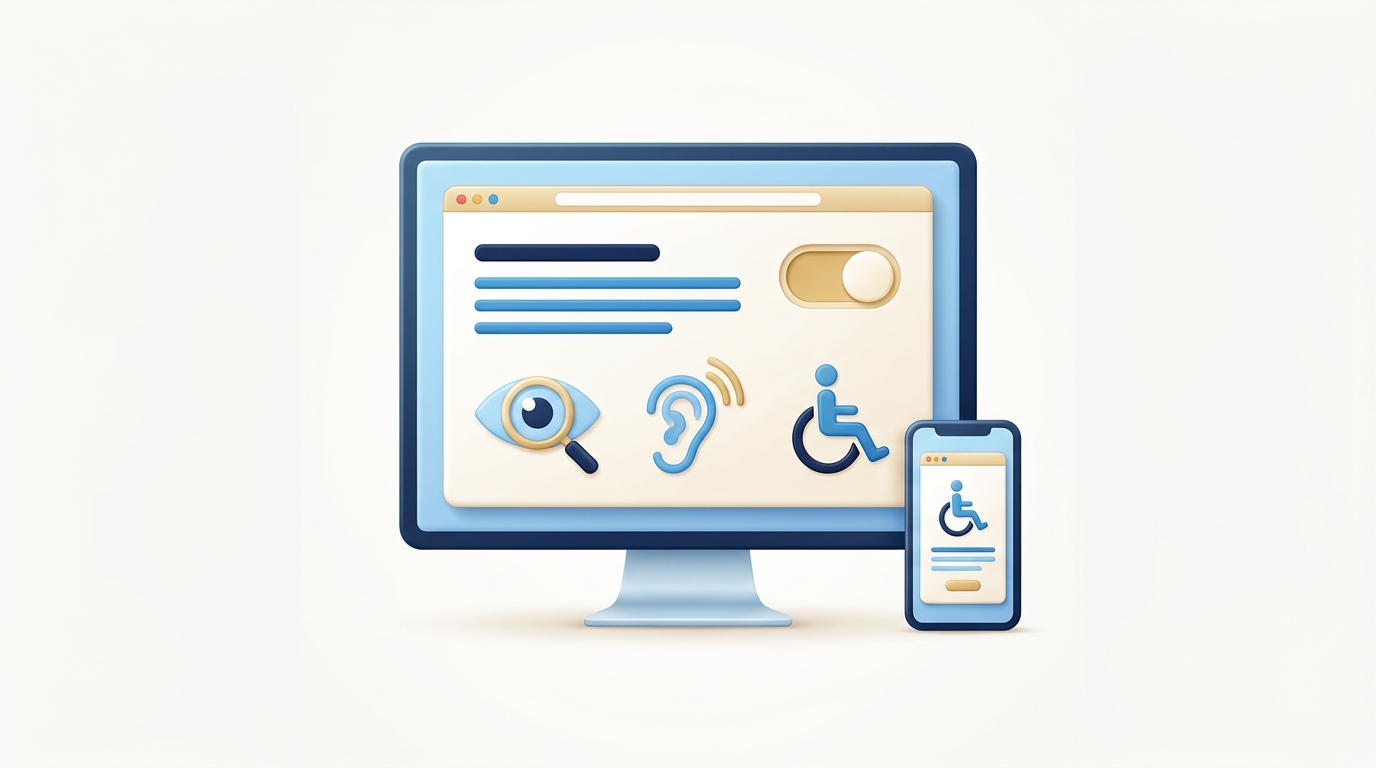
An inaccessible site quietly turns away the people many community organizations exist to serve: Elders, people with low vision, people using screen readers, people on old phones or slow connections. It's not a niche concern. Roughly one in five people has a disability that affects how they use the web.
For publicly funded organizations, it's also increasingly a requirement — not a nice-to-have.
What to look for in a platform
You don't need to memorize the standards. You need a platform that makes doing the right thing the easy thing:
- Semantic structure by default. Headings, lists, and landmarks should come out right without special effort. This is what screen readers rely on.
- Keyboard navigation. Every menu, form, and button should work without a mouse. Try it yourself: tab through the page.
- Real text, not images of text. Text can be resized, read aloud, and translated. A picture of text can't.
- Colour contrast you control. Your brand colours should be usable — dark enough on light, light enough on dark.
- Fast on a cheap phone. Performance is accessibility. A page that takes ten seconds to load excludes people on limited data.
The trap of drag-and-drop builders
Popular website builders promise anyone can make a site in an afternoon. What they don't mention is how much inaccessible markup they generate underneath — empty links, missing labels, images with no alternative text. It looks fine to you and is unusable to a screen reader.
If you use one of these tools, budget time for an accessibility review before launch. If you're building something that has to serve a whole community, it's often worth starting on a foundation that's accessible by design.
A simple test before you commit
Before you choose a platform, ask for a live page built on it and try three things: navigate it with only your keyboard, zoom the text to 200%, and run it through a free checker like WAVE or Lighthouse. If it stumbles on those, it will stumble for your community.
Accessibility done early costs almost nothing. Done late, it's a rebuild. If you want a website that works for everyone from day one, reach out — it's built into how we work.